James Rice, Adam Farquhar, Philippe Piernot, and Thomas Gruber
Knowledge Systems Laboratory
Gates Building 2A, M/C 9020
Stanford, CA, 94305
+1 415 723 3444
{rice,
axf,
piernot,
gruber}@ksl.stanford.edu
Permission to copy without fee all or part of this material is granted provided that copies are not made or distributed for direct commercial advantage, the ACM copyright notice and the title of the publication and its date appear, and notice is given that copying is by permission of ACM. To copy otherwise, or to republish, requires a fee and/or permission.
CHI '96 Vancouver, B.C. Canada
(c) 1996 ACM
Images used herein copyright and other HTML pages (c) 1996 Stanford University
We show how to deliver a sophisticated, yet intuitive, interactive application over the web using off-the-shelf web browsers as the interaction medium. This attracts a large user community, improves the rate of user acceptance, and avoids many of the pitfalls of software distribution.
Web delivery imposes a novel set of constraints on user interface design. We outline the tradeoffs in this design space, motivate the choices necessary to deliver an application, and detail the lessons learned in the process.
These issues are crucial because the growing popularity of the web guarantees that software delivery over the web will become ever more wide-spread.
This application is publicly available at: http://www-ksl-svc.stanford.edu:5915/
Internet application, remote user interface, active document, CSCW, World Wide Web, Hypertext, HTML, HTTP, Java.
The recent explosion in the popularity of the world-wide web and its associated hypertext markup language (HTML) and hypertext transfer protocol (HTTP) presents an exciting new opportunity to provide widely distributed access to sophisticated software applications [16]. The design of HTTP and HTML, however, place a number of novel and often severe constraints on the design of interfaces that use them. This paper outlines our approach to providing a rich user interface to a sophisticated application over the web, specifies our design objectives, the constraints imposed by HTML and HTTP, and the trade-offs that we made in order to meet these objectives whilst satisfying these constraints. We further document the evolution of the design and implementation of our application, and some of the lessons learned. In addition, we also cover a number of topics which are not mentioned in the CHI proceedings version of this paper. These are the use of user preferences, the impact of Java, and ways in which HTML could easily be changed to support this sort of application better.
Our application [1] is a system for browsing, creating, and editing Ontologies. An ontology is a formal specification that defines the representational vocabulary in some domain of discourse [3]. While our ontologies are used for knowledge sharing and agent interoperability [2], they share many properties in common with class libraries, object-oriented specifications, object-oriented simulation components, database schema definitions, and knowledge bases. We expect that many of our design decisions will apply to systems for browsing and editing these types of objects.
For example, an ontology about physical measurement [5] defines logical relations and functions that specify concepts such as unit of measure (e.g., meters), physical dimension (e.g., length), and algebraic operators for unit conversion and dimensional analysis. Such ontologies are used to enable the sharing and exchange of data and models among distributed and heterogeneous applications.
Ontology construction is, by nature, a distributed, collaborative activity [7]. Since an ontology is a specification of a domain that is common to several applications, defining an ontology is analogous to defining a technical standard where effective communication and collaboration is required. Not only must there be some medium for forming consensus on the meaning of terms, but the expertise needed to define and review ontologies is distributed. For example, an ontology of therapeutic drugs is the product of a consensus among practitioners in the field and other potential stakeholders - all of whom are distributed across geographical and organizational boundaries (e.g., hospitals, insurers, government agencies). These properties of the user population motivate the development of distributed collaboration and the ontology editor tool.
Our application is unusual among web services because it allows users to create and edit objects, rather than simply retrieve them by following hypertext links or by making simple database queries.
The implemented application provides a full, distributed, collaborative editing environment with over a hundred user commands, context sensitive help [14], context sensitive user feedback and bug-report collection, multi-level undo/redo, multi-user sessions. It has been publicly available since February 1995 and (as of 1/96) supports about 900 users, about 150 of whom we would classify as "serious," who average over 2000 requests per day. Feedback from users and data collected online support the claim that it is possible to deploy richly interactive applications over the web. Based on our experience in developing the ontology editor, we offer an approach to developing and delivering web-based applications that instantiates this claim.
We came to the web approach out of frustration with conventional approaches to software development and distribution. The costs of ensuring that software was portable over multiple hardware and software platforms together with the cost of distributing software releases, patches, and upgrades were simply too high for a small research institution. Indeed, these costs often dominated our efforts to develop and test new functionality. Providing a system to support distributed collaborative work would only make the situation worse.
The web appeared to be a reasonable alternative. We had previously developed experience in providing automatically generated HTML documents to describe ontologies and other structured objects [9]. People found that using their native hypertext browsing systems to examine these documents was both valuable and appealing.
The ontology editor is a good candidate for this approach because (1) it requires distributed access from heterogeneous environments; and (2) think-time dominates computation time. This makes it possible to provide a useful shared computational resource for a community of users from a centralized server without the hardware costs being too onerous.
The ontology editing environment described in this paper is one out of a number of applications that we have built using the web. To put this work into context, we list some of these applications here.
In this section we begin to describe how we addressed the problem of delivering our network-based application, and how we designed it.
Our goal was to create a general environment to facilitate the development and sharing of ontologies. Such an environment must assist the user in the basic development tasks of browsing, creating, maintaining, sharing, and using ontologies. We also realized that many of our users want to develop ontologies through a consensus process; therefore, we needed to provide tools to help people collaborate during development.
From the outset, we wanted to make our potential user community as large as possible. The target community is diverse and includes academics, industrial researchers, and government employees. Once we had established our web-based system, our user community grew from a handful to hundreds in the space of a few months.
Our burgeoning user community was an additional incentive to use the web. Furthermore, distributed access eliminates the need for our users to have high-end hardware systems or expensive licenses for the proprietary software systems that we used to develop our application more efficiently. A centralized server model also means that we can make changes and upgrades to the server at a single site (or small number of controlled sites); the new, improved software is instantly accessible to all users. In short, we decided that it would be cheaper to provide free computational resources to our entire user community than to develop shrink-wrap software and distribute it to them.
Our challenge was to design a user interface that operates under the constraints of the web, remains intuitive and natural to users, and provides full access to the application.
In order to achieve our goal of broad impact, we worked to make our application intuitive and usable to anyone familiar with web browsers (e.g., Netscape Navigator or Mosaic) so that a new user could pick up and productively use our application without any formal training or preparation. We explicitly addressed this by the following means:
HTML used for documentation: Our application has no manual at all per se. All documentation is provided on-line using the same browser that the user already employs to operate the application.
Guided tour: One important aspect of the documentation is a guided tour [11, 15], which takes the new user through a credible editing scenario, motivating the different features of the system.
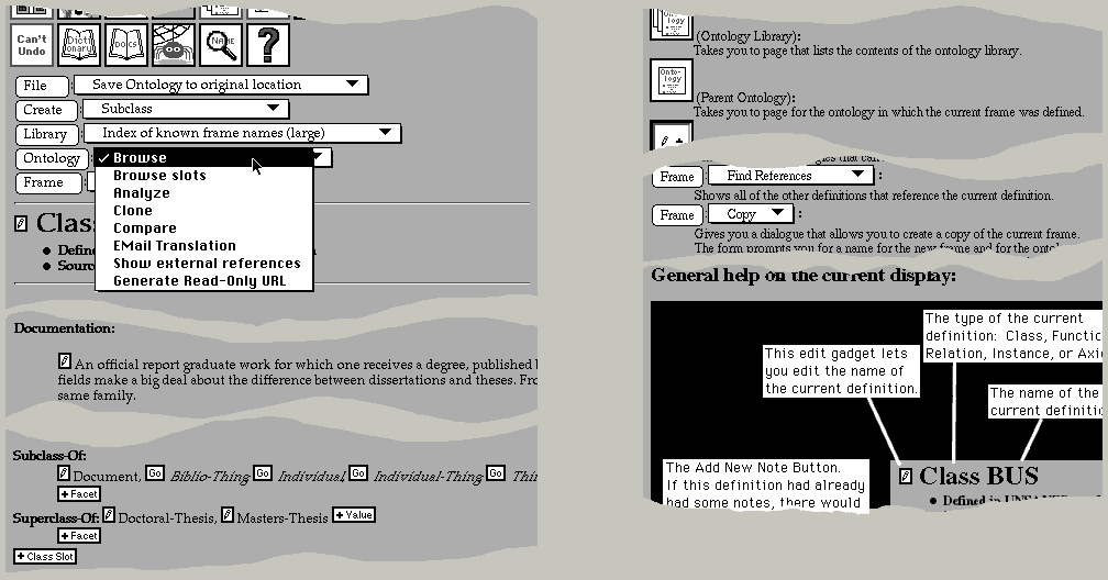
In-context, automatically-generated help: Unlike applications such as Microsoft Word 6.0, in which documentation is available only in an idiosyncratic hypertext browser, our application uses the same hypertext browser uniformly for all of its interface. This means that help and documentation are seamlessly integrated with the rest of the system. Indeed, the help facility builds help pages in real-time so as to give the most focused and helpful response in the user's context. A novel feature of the help facility is that the commands available to the user are echoed as widgets on the help page (figure 1 right). If the user clicks on the widget in the help page which has accompanying explanatory text and links to worked examples, then the command associated with that widget is activated just as if it were invoked on the page from which the user made the help request.
Familiar interface: There was no existing interface metaphor for ontology editing. We selected a document metaphor (as opposed to a two dimensional representation as a directed graph, for example) so that the application could be smoothly integrated into the HTML world. This allows users who are familiar with hypertext documents and browsers to make an easy transition into our interactive application.
Although we were keen to expand our user community as much as possible, we were aware that experienced ontology developers would not want to be held back by an interface that was optimized for naïve users. It is very important to us to support power users. The vast majority of meaningful ontologies are developed by such users, even if these ontologies are then used by the less experienced as building blocks. The issue of power user support was eventually resolved by providing a powerful user preference facility. This allows the experienced user to tailor the look and feel as well as the set of commands exposed at any given time.
In order to be responsive to our users, we wanted to provide an obvious mechanism that they could use to make suggestions and report bugs. We resolved this by providing feedback buttons on every page for comments, questions and bug reports. The application captures the user's context automatically so as to make the user's bug report as useful to the developers as possible.
Because we were intending to provide a multi-user shared resource, it was essential for the user community to find our application both reliable and trustworthy. Otherwise, they would not use it to develop confidential or proprietary ontologies. To this end, our application supports a user and group model similar to that provided by operating systems and password protection to ensure privacy and security. Ontologies are protected by maintaining multiple versions to which the user can revert if necessary. At a finer granularity, a multi-level Undo/Redo feature allows the user to repair any mistakes. A sophisticated compare facility, which compares semantic units rather than text, allows the user to see exactly what has changed; an analysis facility tells the user what ought to be changed.
Our previous software delivery attempts had been plagued by long release cycles, installation difficulties, and problems with patch distribution. Users had to acquire expensive proprietary software and high-end hardware to run the system. This was very unpopular, and substantially reduced the impact of our work by excluding PC and Mac users from the user community. We needed an approach that would overcome all of these problems.
There are a number of possible ways to deliver applications to a user community. In the past, we had always built our software to be as portable as possible, testing it on a number of platforms and with a number of different compilers from different vendors. This approach was necessary because our user community always wanted us to ship source code to them so that they could modify and experiment with our software. The cost of testing and ensuring cross-platform portability proved to be very high. Users would often employ versions of operating systems, platforms or compilers to which we had no access. One way to address this problem would have been to offer only shrink-wrap software releases to our users. This was not a tenable option because of the diversity of platforms in our user community. We simply could not build a "PC-only", or "SUN/OS-only" application. Our new approach of keeping control of the software, and shipping a network service seemed the best way for us to overcome the difficulties of shipping software, while being able to impact a wide user community.
Figure 1. The final design (left) used a row of icons (top) for important or frequently used operations, and pop-up menus preceded by submit buttons (e.g., "File" top left) as labels. Selecting the `?' help command (top center left) takes the user to a page explaining all applicable commands, and with a labeled explanation of the page (right). The command widgets on the help page are real. Selecting one of these widgets will execute the command in the context of the page that the user was on. Tears in the figure elide material extraneous to this discussion. Note: this figure is very wide and might require horizontal scrolling to see the right-hand part of the figure. A slide show exemplifying the Help feature can be found here.
There are only two ways for the browser to transmit information to the server (i.e., the application). Selecting an anchor transmits a request to follow a hypertext link. Pressing a submit button transmits the widget state. Until a submit button is pushed, it is not possible for the server to determine anything about intermediate activities that a user might perform such as typing text into an input field, toggling radio buttons or check boxes, selecting items from menus, moving the mouse, and so on.
The only way for the server to transmit information to a browser is in response to a submit or select action initiated by the user. Moreover, there is a fundamental difference between the type of interaction supported by HTML and the forms of interaction with which we are all accustomed in graphical user interfaces. In GUIs, operations typically take the form of the user selecting an operand or operands through direct manipulation and then applying an operator by means of a menu selection or keyboard accelerator. In HTML-based user interfaces, there is no notion of selecting objects pre se. There are, in effect, two disjoint forms of interaction:
In effect, an HTML interface can allow the user to apply a number of different commands to a single object, or a single command to a one of a number of different objects. Commands that take multiple operands are much harder to implement.
Consequently, it is currently impossible to implement many features of sophisticated user interfaces over the web. In particular, tightly coupled interfaces that provide immediate feedback to the user are not possible. For instance, given an initial menu selection, it is not possible for the application to gray out options that are incompatible with it. Furthermore, there can be no direct manipulation of objects such as one might find in a graphical class browser. Finally, it is not possible for the application to preempt the browser's activity or provide any asynchronous communication. For example, it is not possible to notify the user asynchronously about the results of a background task or remind the user to save work.
Delivering notifications of collaborators' work on shared data is another problem. Since several people simultaneously edit the same ontology, we need to provide some way for users to be made aware of the changes made by others. Today's HTTP makes this difficult because it does not allow a server to send unsolicited notifications to the client. We work around this limitation by presenting pending notifications at the top of the page in a dialog. The notification includes a textual description of the changes being made by collaborators on shared data, and a link is provided that will take the user to the modified object. Within a shared session, users share the same undo history so that a user can undo damage performed by a less enlightened user. A command is also provided to make announcements to users so that they can be forewarned of a change to come and be given a suitable justification. An improvement to the HTTP standard to accommodate asynchronous notifications would be preferred (some are being proposed).
Bandwidth is a key constraint. Each user action (submit or select) causes an entire new page to be transmitted back to the browser over the network. There is no method for the application to cause an incremental update of a portion of the display. Even on high-bandwidth local area networks, transmitting and rendering large pages is time consuming; for distant browsers it becomes the dominant cost.
The application has very little control over appearance. HTML explicitly cedes rendering decisions to browsers. This has many advantages for browsing hypertext documents, but it proves awkward for interface design. There is little control over the location of displayed objects on the finally rendered page. In particular, if a page is too large to fit on a single screen, there is no way of controlling how and to where the browser will scroll the page. This registration problem can be very difficult to work around and frustrating for users (see section 3.4).
The widget set available through HTML's forms capability is extremely restricted. It includes only pop-up menus, single/multiple selection scrolling lists, submit buttons, checkboxes, radio buttons, mapped images, and text type-in widgets (see figures 1 and 2). There is no way to combine either submit button or anchor behavior with a pop-up menu to provide the sort of command selection model that is present in so many user interfaces (e.g., the Macintosh menu bar). There is no way to associate a "right button" menu with items, nor is there a way to provide constraints on selection elements (e.g., toggling "show text files" causes a scrolling list of files to filter out non-text files). There is also no way to include iconic elements in menus or scrollable lists. (See here for a comparison of the widget set under different platforms)
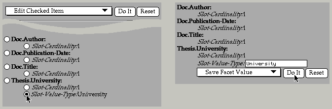
Figure 2. In early designs, radio buttons were used to select an argument (left). Selecting an operation from a pop-up menu and clicking on a submit button (top left) inserted suitable edit widgets into the flow of the page at the selected location (right). A slide show of the actual mockup HTML pages can be found here.
A growing number of web browsers from a variety of institutions and vendors make non-standard extensions to the published protocols. These browsers provide different levels of support for features in the protocols. Fortunately, the protocol provides a means for browsers to identify themselves (although they do not describe their capabilities in a meaningful way), which allows servers such as ours to be sensitive to some of the distinctions between them.
A unique feature of web browsers is that they cache previously seen pages and allow the user to revisit these cached pages without notifying the server. In interactive applications delivered on the web, these "previously seen pages" can represent earlier states in a dialog with the user. As a consequence, the browser allows the user to travel back in time to an earlier interaction state and attempt to execute the commands as they were presented then. Since the state of the data on the server may have changed as a result of the user's interactions with the server, incoherent transactions can result. There are two alternative ways for applications to handle this. Applications must either support time-travel, or they must always reflect the most recent state. For example, suppose that a user engages in a dialog to delete an object and then backs up to a page on which the object is still present. If the user selects the deleted object as represented on that page, the application should either undo the deletion or report an error in a graceful way. Our application chooses the latter approach.
The underlying principle of our design was to minimize the cognitive load on the user imposed by the interface [8]. As we worked within the constraints of HTML and HTTP to meet our objectives, we used this principle to guide our design decisions. The steps we took included: minimizing the number of intermediate states in complex command execution, minimizing the number of distinct types of pages, the number of distinct widgets, working to achieve consistent appearance across browsers, but working within the widgets provided by the native window systems. In this section we discuss these issues in more detail.
The restrictions on the widget set force complex interactions to be broken down into a sequence of simple ones punctuated by submit actions and the transmission of intermediate pages. To simplify the execution of complex commands, we chose (1) to minimize the number of actions that the user must perform, and (2) to minimize the number of pages presented during the course of the interaction. It is important to minimize these because of the cognitive effort required to parse and understand a new page, because displaying a new page makes it change registration (see section 3.4), and because transmitting and rendering a page may take several seconds.
The desire to minimize the number of clicks and intermediate pages has some consequences. Because we want to minimize the number of clicks that a user performs, we are inclined to make pages richer (and potentially more confusing) to a user. Our application consists of the display and editing of a hierarchy of objects; classes exist within ontologies, classes have slots (attributes), and those slots can themselves have facets (attributes of attributes). We could have chosen to present a different page for each slot and for each facet in any given class. Instead, we display all of the slots and facets of a class on a single page. A user can therefore edit a facet value directly on a class without going through any intermediate pages. This design helps to satisfy our goal of minimizing the number of clicks and intermediate pages, but at the expense of making the pages larger and more complex. The user is presented with considerably more information than may be of interest, and the user is more likely to have to scroll in order to see what is of interest.
In order to minimize the number of different-looking pages to which the user would be exposed, we decided that the editing environment should look as much like the browsing environment as possible. This is natural in our application, because even when a user is creating new objects, most of a user's work is browsing. We preserve the browsing environment's look and feel by inserting edit widgets into the flow of the HTML page (see figures 2 and 3) in a manner similar to the protoTextExpando widget in the Newton user interface [12]. An example of this insertion of edit widgets into the flow of the HTML page can be found here in the middle of the worked example.
A page was to be a representation of a specific object. This meant that commands on the menu bar would implicitly apply to the underlying objects which may be nested (e.g., an attribute of a class in an ontology.) Commands applicable to all of these may appear on the menu bar.
We decided that in the normal course of events the user should be exposed to the minimal number of distinct widgets. The final design includes only five types of widgets (see section 3.2).
We wanted our user interface to work in the same way across all platforms and browsers. This would minimize training and documentation problems. We explicitly chose to limit use of undocumented or non-portable extensions provided by different browsers. One significant exception to this decision is HTML tables, which provide a much better way to present tabulated information than is otherwise possible. We use HTML tables when communicating with a Netscape browser [13] and use PRE formatted text (a fixed-width font display mode) for other browsers.
We explicitly decided to support multiple browsers. Some user interfaces on the web are almost unusable without using Netscape. We did not want to limit our user community in this way, and so preserved a consistent look and feel across platforms and browsers.
Many developers choose to exercise artistic control over the look and feel of their web pages by using custom bitmapped graphics for buttons instead of the native look and feel that the web browsers provide. Consequently, their web pages look more uniform across platforms, but users must learn to recognize buttons anew for each of these idiosyncratic applications. Furthermore, when this mapped graphic approach is used, the browser is not able to provide feedback to the user about which regions of the bitmap will result in commands being executed.
In contrast, we chose to use the native window system's submit buttons for our interface. Our application was going to be complex enough without the user having to relearn what a button is supposed to look like.
The constraint of supporting naïve users meant that we could not allow any user interface tricks such as having extremely stylized icons that cause differing behavior depending on where on the icon the user clicks. While such approaches allow very terse and dense displays that efficiently take advantage of the available screen real-estate and bandwidth, they would be difficult for members of our target community to understand and learn.
As we saw in the previous section, the design for our user interface was influenced both by a number of hard constraints imposed by our need to deliver our application over the web, and a number of design choices that reflected our beliefs about the usage patterns of our system and our prospective user community. In this section we describe the evolution of our design and our software, and show how we changed our user interface as we learned more about the application and received user feedback. One of the significant advantages of our implementation approach - a central server and standard browsers, coupled with a dynamic, rapid-prototyping implementation infrastructure - was that we could rapidly receive user feedback and introduce changes in response, often within a few minutes or hours. This meant that as soon as the server was established, our design progressed very rapidly. In this section we describe several of the significant events in this evolutionary process.
We were fortunate to start this project with a preexisting substrate. Earlier work had enhanced Ontolingua [3], our ontology development tool so that ontologies could be compiled into static hyperwebs (see here for more on this process and examples). These hyperwebs displayed the concepts in the ontology with one concept per page. Our first step, therefore was to take pages of hypertext generated by this compilation process and manually edit them so as to mock up the editing interface. This process of developing mockups lasted about two weeks and went through multiple iterations, experimenting with different ways to handle the perceived problems of having a simple user interface that was nevertheless powerful. Early designs experimented with putting edit widgets next to each of the potentially modifiable objects in the page being displayed. Selecting one of these edit widgets would take you to a different mockup page with, for example, a text widget allowing the user to edit the selected value. These mockups can be seen here. The whole mockup process was performed by editing these HTML files to refine the design.
We tried several different approaches to provide the functionality of a right button command menu, which is not supported by HTML. For example, in one mockup, there was a radio button in front of each editable object, and at the top of the page was a pop-up menu of operations to be applied to the object selected with the radio button (figure 2). A "Do It" submit button caused the execution of the selected operation. This method requires three different widget selections which involved mouse travel from the selected object back to the top of the page and often required the user to scroll the viewport. This would have been burdensome on our users.
We addressed this problem by using a single intermediate page for edit operations, and by limiting the expressiveness of the user interface - we do not allow the user to execute all conceivably legal operations at any given point. We eventually settled on a design in which a small edit widget would be placed next to any editable object. Selecting this widget would take the user to a page just like the current page, only with suitable edit widgets replacing the value that was selected, and allowing the user to select between a number of possible edit options.
In our application, it is necessary to be able both to create new objects (e.g., classes) and also to add objects to existing objects (e.g., add a property or value to a given object). Finding a good way to represent this proved tricky, and we experimented with several methods. For example, we tried using a "dummy" entry for values, so that for every list of values there would be an extra one at the beginning (or end) in italics that was a place holder for a new value to be added (this is an example of this design mockup). This was found to be confusing, and was soon dropped in favor of the design described in the next section.
Moving on from our mockups, our initial implementation of the editing environment attempted to implement the design that we had mocked up as closely as possible, but we rapidly ran into difficulties. For example, in the mockups, quite by chance, we had selected an object which had only one value for each of the attributes being displayed. This encouraged us to position a single edit widget in front of the set of attribute values in order to elicit and/or modify all of the values simultaneously in one text widget. We soon discovered that the more general case of there being several attribute values was very common and the single text widget approach was confusing to our users. Problems with eliciting multiple values in a single text widget were compounded by our desire to edit values in context, which made us want to minimize the size of the text widget. Values were sometimes scrolled out of the user's viewport, which resulted in erroneous editing operations and much confusion. Early user feedback quickly caused us to change our design in favor of eliciting or editing only one attribute value at a time. This had the side-effect of increasing screen clutter by putting individual edit widgets in front of every editable value (figure 3 left).
The next problem that arose was that users were confused by the methods for creating and adding objects and values. They often added values that were illegal or non-existent objects. The number of possible legal values for attributes in the system is typically too large to enumerate explicitly. Because of this, we developed a sophisticated, context-dependent completion facility, which space prevents us from describing here.
After a few iterations we ended up with a design which we have broadly kept since this early stage (see figure 3). In this design, we distinguish between five different types of widget:
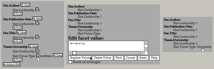
Figure 3. The final version uses edit widgets in front of all editable objects, and "+" widgets wherever an addition is possible (left). In this example, we show editing the Slot-Value-Type facet value of Thesis.University from Institution to University. Selecting an edit pencil inserts the necessary widgets to elicit or modify the value in context (middle). The user has entered University instead of Institution. The user can remove screen clutter by inhibiting all edit widgets (right). Here is a detailed worked example of an editing session using the ontology editor, showing a number of the features of the editor.
Although we went to considerable effort to make the user interface clear and intuitive, it was still novel in many ways. To familiarize new users with the meaning of the various icons and edit widgets they might see, we introduced a "Welcome" page which displays the icon images together with a brief explanation. Users can suppress this page once they are familiar with its contents.
By this point, we were able to edit values and create new objects in our system, but we were unable to save our changes. Our user interface mockups had focused exclusively on the different ways to edit objects in the system - they completely neglected the sorts of operations that are typically found on the "File" menu of a normal user interface. This presented us with a problem. We already had a row of buttons at the top of the page that would provoke the creation of new objects. When we added the options that were necessary for typical file menu operations we found that we had a glut of buttons. The number of buttons would only increase as the system became more sophisticated.
At this point, we had to make a significant compromise. Again, because HTML does not support pop-up submit buttons, we were unable to implement the obvious and familiar behavior of a menu bar. The only "correct" model for command menus in HTML is the exhaustive enumeration of the commands as submit buttons. This was untenable because of the number of commands we needed to support (typically around 40 per page). As an alternative, we partitioned the commands into broad classes and put the commands on menus. In front of each menu we placed the name of the menu as a submit button (see figure 1, top left). This meant that the user had to select an option from the menu and then click on the submit button to execute the selected operation. This is non-standard, but we found that our users got used to it fairly quickly, probably because we went to significant effort to make sure that the system would always put the most likely choice as the default option on the menu. Thus, a single pointer operation often suffices.
Because we could not predict whether our users would find the factoring of commands onto menus with submit buttons described above reasonable, we introduced a user preferences mechanism that allowed the user to control, among other things, the look and feel of these menu commands. In practice, most users ended up accepting our default setting for the command menu's look and feel. The desire for menu flexibility was the impetus for us to introduce a user preferences facility, but this feature has become ever more important in our system. Users connect to our application from all around the world from sites with widely differing quality of network connectivity. Consequently it is very important to support options that let the user trade prettiness or verbosity for bandwidth.
The issue of how much power to give to the user came up with the introduction of this command menu model. Our system is non-modal in the sense that it is always theoretically legal to jump to (say) a class creation dialog from the middle of a different object creation dialog. By default, we choose to hide this fact from users in order to simplify the appearance of the user interface. However, power users resent such restrictions, and so we have had to add extra preferences to allow our power users full access to all applicable commands, irrespective of their current context.
By the time the system had reached this level of sophistication, we had made our application available to the public, and around one hundred users had tried it out. We quickly found that users were unable to visualize large ontologies with hundreds or thousands of concepts. This is a problem analogous to browsing a flat file system with hundreds or thousands of files. We considered using a graphical rendering of the hierarchy [10], but this had several problems: transmitting large images is too slow; it is not possible to position the image so that a particular object is visible; the browser cannot tell which portions of the image are links, and the browser may not be able to display graphical data. We chose to provide a hierarchical browsing mechanism with the same sort of triangular open/close widgets that are found in the Macintosh file system. The system uses a heuristic method to compute the appropriate initial set of objects to display in the "open" state (figure 4).
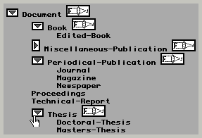
Figure 4. The hierarchical class browser shows large graphs of objects in a compact form. Triangular widgets open and close subgraphs. "Focus" widgets move the selected object to the root of the displayed tree.
We found that however hard we might try, our application always produced pages that were multiple screens in height. Consequently, we replicated the menu bar at the bottom of the page so that the user could scroll to the nearest end of the document in order to select one of these more global commands.
User feedback has caused us to spend more effort on displaying large ontologies. We have recently addressed this by factoring pages showing large ontologies automatically. We have also introduced a method of focusing the hierarchical browsing tool onto subgraphs of the class lattice, and for using this same hierarchical browsing technique to look at attributes as well as classes and instances.
Our early design criteria had called for trying to preserve the illusion that there were only a few different types of pages: one for ontologies, one for the library, and one for frame objects. Edit widgets would be inserted in-place to preserve the look and feel of these pages (see figure 3). When it came to object creation, we did not, of course, have an object to display. When the user selected a creation operation, we presented the user with a fake page representing an object of the type being created, with a text widget into which the user could enter the new object's name. This preserved a uniform look and feel for all of our pages. We rapidly discovered that this approach confused our users. Their cognitive model of object creation was sufficiently different from normal editing and browsing operations that being presented with a fake page for the object to be created was confusing. The users clearly liked to think of the creation pages as being (pseudo) modal dialogs, and didn't want to view the creation page as an ersatz, incomplete object.
Another problem with the edit-in-place model of interaction is that HTML and HTTP give no effective control over viewport positioning. This means that when the user selects an edit operation, we have no choice but to refresh the whole page (unlike a more tightly-coupled user interface in which the system might push existing text aside in order to make room for the edit widgets). Although it is possible to tell the browser where to scroll to on the new page, this is very coarse-grained control. Browsers differ significantly in their scrolling behavior, and this typically results in a loss of registration of the user's viewport, and therefore the loss of the user's cognitive focus.
In practice we suspect that it might be better not to use this edit-in-place model, but rather to use simple pages that give the illusion of modal dialogs. This is an open design question and needs further investigation. Registration of the display is only reliable when the whole HTML page is less than one screen in height. Because browsers cannot inform the server of the browser's window size or exact viewport position within a document, this problem cannot be solved in general. Furthermore, our application typically generates HTML pages more than one screen high.
We have conducted one informal email survey of our users and have collected over 1500 in-context comments and bug reports. Together with informal observation of local users, we have observed several surprising characteristics of system usage.
We have noticed that users are reluctant to experiment freely within the application. This becomes an issue when users are unable to understand an icon or command. They do not try it to see what it will do. This surprised us. We had expected that users would experiment freely because the network connection isolates them from most problems. There are several possible explanations for their behavior: They may be avoiding wasting their time. Some browsers are difficult to interrupt if an address is not well formed, a server refuses to respond or responds slowly, or if a large document is transmitted. They may be trying to protect their work. Many web-based applications are brittle and crash unexpectedly. Few applications provide as many safeguards as ours does against irrecoverable damage. They may also be trying to protect the work of other users by following only understood paths. It would be interesting to find out why users are so reluctant to experiment, since this could have significant impact on the design of networked application user interfaces if this behavior proved to be widespread.
We have observed that our users have a powerful desire to be able to log out of our system. Because a user's connection with our application lasts only as long as each individual request from the browser - typically only a second or two - and because the user could walk away, leaving the browser at any time - we have had to engineer the system so that logging out is not necessary. The system has a set of timeouts and defaults that allow it to recover quiescent resources. However, we have noticed that users feel a need to log out, even when they are told explicitly that it is not necessary. We have therefore provided a command to give the user the illusion of logging out.
It is often assumed that preferences in applications are not of significant utility because few users actually change them. If we look at active users, whom we define as those who have executed at least 50 commands, we find that some 41% of our users have changed at least one preference. Figure 5 plots the distribution of the number preferences modified against the number of requests performed by each user. There are 47 preference variables in the system of which 42 have been modified by at least one user (here is an example page showing the preferences dialog). Some preferences have been modified by only one user, one has been set by 47 users. From the graph we can see that although power users are changing more preferences, as one would expect, they are changing a focused set of preferences. We conclude from this that although there is a fairly large number of preferences, the number is not wildly in excess of the number needed to represent the degree of customization required by our users.
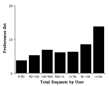
Figure 5. The average number of preference variables set by each user plotted against the total number of non-trivial requests made by each user to our server
If we look at the actual preferences that are being set, we
see that a number of the selections clearly represent a
particular user's personal preference for some particular look
and feel, other preference selections are clustered around, for
example, a number of preferences that allow the user to control
the bandwidth used in communicating with our server. Indeed, we
have found that the issue of bandwidth is sufficiently important
to our users that we label any preference that might impact
bandwidth with a ![]() splash graphic.
splash graphic.
The web is an ever-changing medium, and both the technology and standards are advancing very rapidly. We must therefore consider what we would do (or would have done) if Java or some similarly capable remote scripting facility were to be reliable and powerful enough to use for our application. Certainly, had Java been ready for serious use a year ago we would have been very tempted to use it to get around some of the severe constraints of HTML. In this section, we detail some of the issues surrounding the use of client-side applets, and we then enumerate some of the simple changes that could be made to HTML to make this sort of application much easier and better.
Please note that although in this section we refer to Java, the reader should treat this as a generic reference for some facility that allows the portable specification of client-side applets. At present, it would appear that Java will win this war, but this is by no means certain.
HTML could be extended to provide better support for more sophisticated applications, making user interaction more satisfactory and implementation cheaper and simpler. Please note that although we show some examples of how one might like to represent some of these ideas, some of these examples violate the current lexis and syntax rules of HTML. To address all of these issues, a proper rewrite of HTML would be required. Sadly, we are probably stuck with all of the warts of HTML.
          <A HREF="some-default.html"
             ALTERNATIVES="red.html",
                          "green.html",
                          "blue.html"
             ALTERNATIVE-PRINTED=
               "Red",
               "Green",
               "Blue">
          Color
          </A>
          <INPUT NAME="My Button"
                 TYPE="URL"
                 VALUE="URL-for-my-button.html">
          <INPUT TYPE="submit" NAME="My Button"
            VALUE="my-button"
            ACTION="/cgi-bin/foo#scroll-to-here">
          <INPUT TYPE="SUBMIT"
                 NAME="My Button"
                 VALUE="my-button"
                 ACTION="#scroll-to-here">
Scroll-position: <<name>>[+/-<<lines>>]
Scroll-to: <<name>>[+/-<<lines>>]
          <TEXTAREA NAME="my-textarea"
             scrollbarpositions=<<positions>>>
             ....
          </TEXTAREA>
          <<positions>> ::= <<position>> |
                          <<position>>, <<positions>>
          <<position>>::= [vertical|horizontal]
                          = [left|right|top|
                             bottom|none]
          <INPUT TYPE="submit"
                 LOCATION="menubar"
                 MENU="Ontology Editor|Create"
                 NAME="Class"
                 VALUE="create-class">
          <A HREF="item-1235897" DOCUMENTATION="Edit Class">
          <INPUT TYPE="SUBMIT"
                 DOCUMENTATION="Delete this class and all of its subclasses"
                 NAME="Delete">
          <SELECT.....>
              <OPTION DOCUMENTATION="The color red in RGB values">
                Red
          </SELECT>
<CANONICAL-URL "some-URL">
<IMG SRC="some-picture.gif" GRAYED-OUT>
<OPTION UNSELECTABLE>Some option
          <A HREF="foo.html">
            <IMG SRC="graphic.gif"
                 BORDER=0
                 MARK-IF-VISITED>
          </A>
          <A HREF="foo.html" NEVER-VISITED>
             ...
          </A>
          <INPUT TYPE="SUBMIT" NAME="Do it"
                 KEY="D">
          <DEFINE NAME=1>
           <IMG SRC="/image/gadget.gif" BORDER=0>
          </DEFINE>
We have shown how we were able to deliver a sophisticated, yet intuitive, interactive application as a network service. An off-the-shelf web browser provides the user's interaction medium. Leveraging standard browsers attracts a large user community, improves the rate of user acceptance, avoids software installation and distribution problems, and dramatically reduces turnaround time for software development.
The key contribution of this paper is to describe the constraints imposed on user interface design by this interaction medium, outline the tradeoffs in this design space, and motivate the choices we made in order to deliver our application over the web. We further outlined the lessons we learned and the design changes we made as the interface evolved in response to user feedback.
These issues are crucial because the growing popularity of the web ensures that this form of software delivery will become ever more wide-spread.
This application is available on the web at:
http://www-ksl-svc.stanford.edu:5915/
The authors gratefully acknowledge the support of the following funding agencies: NASA Ames Research Center under contract NCC2-537, ARPA and NASA/ARC under contract NAG2-581 (ARPA order 8607), and CommerceNet under contract CN-1094 (TRP #F33615-94-4413). Numerous people in our user community were both influential and helpful in the development of this application, particularly Wanda Pratt, Rupert Brauch, and Richard Fikes.